Why Your SaaS Website Isn't Converting (2026 Framework)
You're getting traffic. You're spending on ads. But the conversion numbers won't move. Here's the 2026 framework we use to diagnose and fix SaaS websites that underperform.
Author:
Weabers Team
Traffic is not the problem. Your website is.
This is the most common conversation we have with SaaS founders: "We're getting 20K visitors a month but only 40 signups." That's a 0.2% conversion rate. Industry average for SaaS is 3-5%. Something is broken — and it's almost never the traffic source.
After auditing over 60 SaaS websites in the past two years, the failures cluster around the same structural issues. Not design taste. Not color choices. Structural issues in how the page communicates value, builds trust, and guides action.
Here's the framework we use to diagnose and fix them.
The 5-second clarity test
Load your homepage. Start a timer. Can a first-time visitor answer these three questions within 5 seconds: What does this product do? Who is it for? Why should I care?
If your hero says "The next-generation platform for intelligent workflow orchestration" — you've already lost. That sentence contains zero information a buyer can act on. It doesn't name a problem. It doesn't name a person. It doesn't promise an outcome.
The fix is always the same: rewrite the hero around the outcome your best customers actually experience. Not your features. Not your technology. The change in their life after they use you.
The trust gap
In 2026, buyers are more skeptical than ever. Every website says "AI-powered." Every product claims to save time. The trust bar is higher, and generic claims don't clear it.
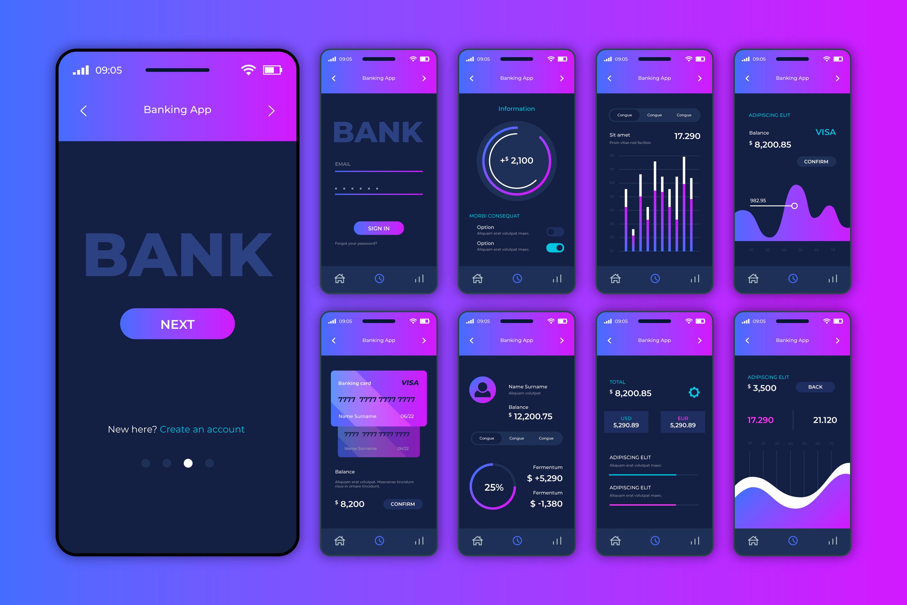
The websites that convert have specific, verifiable proof throughout the page — not just in a testimonials section at the bottom. We're talking: named companies with specific metrics ("Acme reduced onboarding time by 63%"), recognizable logos near the hero, and real screenshots or demo videos instead of abstract illustrations.
Social proof isn't a section. It's a layer that runs through the entire page.
The CTA hierarchy problem
Most SaaS websites have one CTA repeated everywhere: "Start Free Trial." This is asking for the same level of commitment whether the visitor arrived from a Google ad three seconds ago or has been reading your case studies for twenty minutes.
The highest-converting sites we've built in 2026 use a friction-matched CTA strategy:
Cold traffic (top of page): "See how it works" or "Watch 2-min demo" — low commitment, high curiosity.
Warm traffic (after value props and proof): "Start free trial" or "Try free for 14 days" — they understand the value now.
Enterprise visitors: "Talk to sales" or "Get a custom demo" — different buying process, different ask.
One CTA for everyone is leaving conversion on the table for everyone.
Interactive demos are outperforming static screenshots
This is the biggest shift we've seen in 2026. Static product screenshots on the hero are being replaced by interactive product demos — embedded walkthroughs where the visitor can click through the actual product experience without signing up.
The data is clear: pages with interactive demos convert 2-3x higher than pages with static images. The reason is simple — the visitor answers their own objections by experiencing the product. No sales call needed.
Tools like Navattic, Storylane, and Arcade make this accessible even for early-stage startups. If your product has a clear "aha moment" that can be shown in 60 seconds, an interactive demo on your landing page is the single highest-ROI change you can make.
Mobile isn't responsive — it's a different experience
60%+ of initial research happens on mobile. But most SaaS websites are designed desktop-first and then squeezed down. The result is a mobile experience that's technically responsive but functionally broken: tiny text, buried CTAs, and horizontal scrolling on data tables.
Mobile CRO in 2026 isn't about making things fit on a smaller screen. It's about cognitive load and thumb effort. The mobile visitor is scanning, not reading. They need the core value prop, one proof point, and one CTA — above the fold, accessible with one thumb.
Page speed is a conversion variable, not a technical metric
Every 100ms of additional load time costs you measurable conversion. This isn't theoretical — it's been validated across thousands of A/B tests. A page that loads in 1.5 seconds will convert meaningfully better than the same page loading in 3 seconds.
Yet most SaaS websites we audit have a Largest Contentful Paint above 3 seconds. The usual culprits: unoptimized hero images, render-blocking JavaScript, third-party analytics scripts loading synchronously, and web fonts that flash or delay.
Treat Core Web Vitals as conversion optimization, not as an IT checkbox.
The framework, summarized
When a SaaS website isn't converting, run through these in order: clarity (5-second test), trust (specific proof), CTA hierarchy (friction-matched), product demonstration (interactive over static), mobile experience (thumb-first design), and speed (sub-2-second LCP). Fix them in that order — each one compounds on the others.