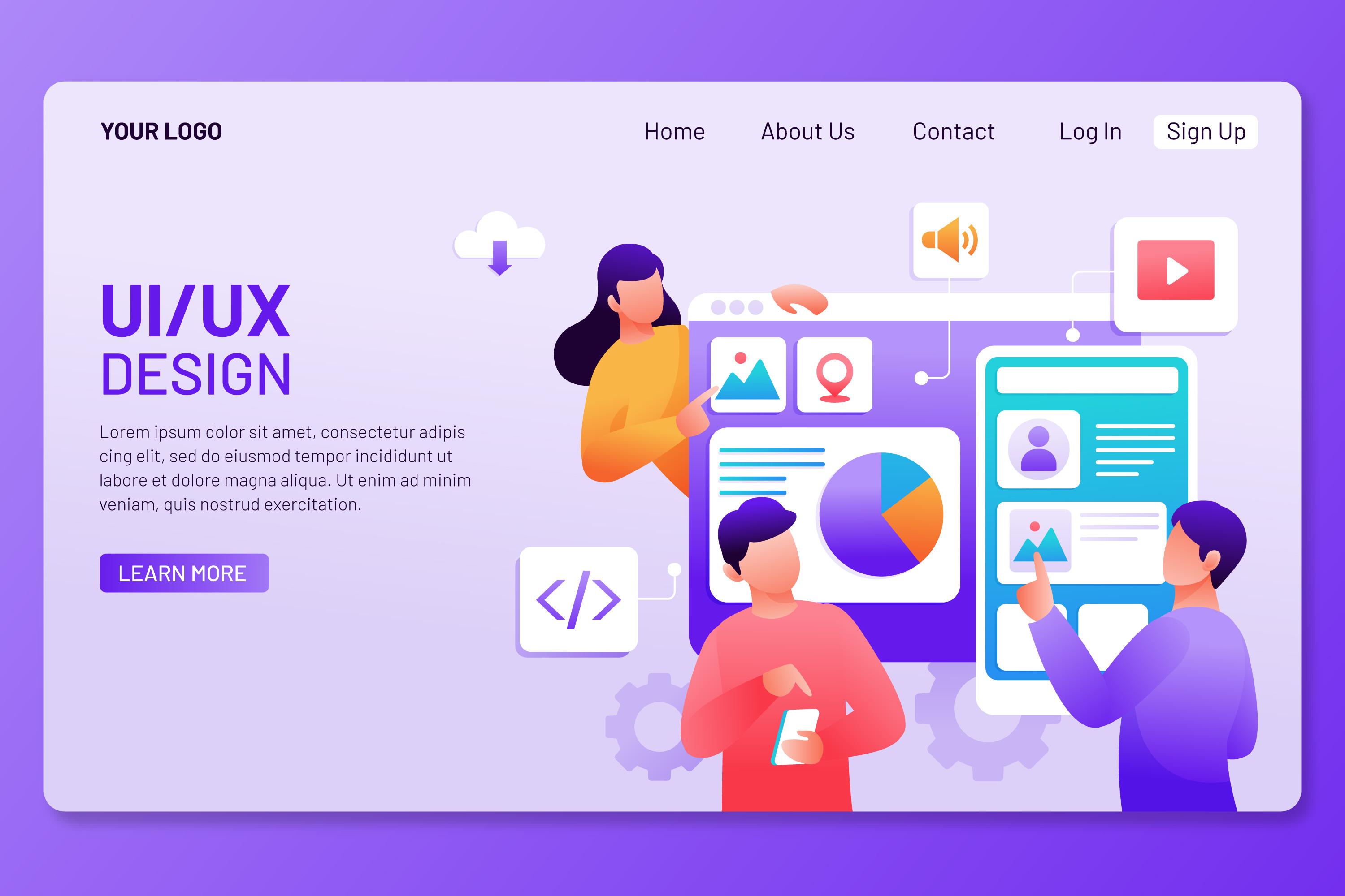
Accessibility-First Design: Why It's Non-Negotiable in 2026
ADA lawsuits are up 300%. But compliance is the floor, not the ceiling. Accessible design is simply better design — and it converts better too.
Author:
Weabers Team

Accessibility isn't a feature. It's a quality standard.
Let's get the legal reality out of the way first: ADA-related website lawsuits in the US have increased by over 300% since 2020. If your website isn't WCAG 2.1 AA compliant, you're not just excluding users — you're carrying legal risk. And that risk is growing, not shrinking.
But framing accessibility as a legal checkbox misses the point entirely. Accessible design is better design. It creates clearer interfaces, more readable content, and more usable experiences — for everyone, not just people with disabilities.
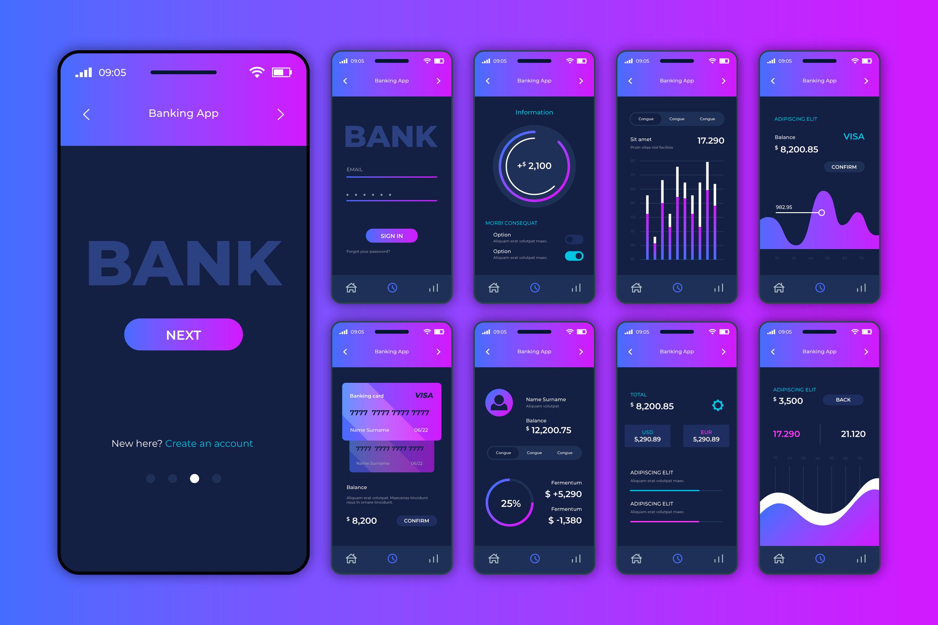
What WCAG compliance actually means in practice
WCAG 2.1 AA — the standard most US courts reference — comes down to four principles: perceivable, operable, understandable, and robust. In practical terms for a SaaS website, this means:
Contrast ratios. Text must have sufficient contrast against its background. For normal text, that's a minimum 4.5:1 ratio. For large text, 3:1. This catches the most common accessibility failure: light gray text on a white background that looks elegant in Figma and is unreadable for 20% of your visitors.
Keyboard navigation. Every interactive element — links, buttons, form fields, modals — must be reachable and usable with a keyboard alone. No mouse required. This matters not just for screen reader users but for power users who navigate by keyboard, and for anyone with a motor impairment.
Alt text and labels. Every image needs descriptive alt text. Every form field needs a visible label (not just placeholder text). Every icon button needs an accessible name. Screen readers can only describe what's been labeled.
Focus management. When a modal opens, focus moves to the modal. When it closes, focus returns to the trigger. Tab order follows visual order. Focus indicators are visible and distinct. This is where most SaaS websites fail — not because they're inaccessible by design, but because focus management was never considered.
The design improvements you get for free
When you design for accessibility first, the quality of the overall design improves as a side effect:
Sufficient contrast ratios force you to make deliberate color choices instead of defaulting to low-contrast "minimalist" grays. The result is more readable, more impactful design — not less attractive design.
Visible form labels eliminate the UX anti-pattern of placeholder-as-label, which fails when the user starts typing and can no longer see what the field is for. Proper labels are better UX for 100% of users.
Logical heading hierarchy (H1 → H2 → H3 in order) isn't just for screen readers — it creates clearer content structure that helps every visitor scan and navigate the page.
Touch targets of at least 44x44px (WCAG 2.2) make buttons easier to tap on mobile for everyone — not just users with motor impairments.
The common objections, addressed
"Accessibility makes the design boring." No. Inaccessible design is lazy design. The constraint of meeting contrast ratios and designing visible focus states actually produces more thoughtful, more polished interfaces. Linear, Vercel, and Stripe are all highly accessible and nobody would call them boring.
"We'll fix accessibility later." Retrofitting accessibility is 3-5x more expensive than building it in from the start. It touches every component, every page, every interaction. Doing it right the first time is cheaper, faster, and produces a better result.
"Our users don't need it." 15% of the global population has some form of disability. That's not a niche segment — it's the size of China. And it doesn't include the situational disabilities that affect everyone: using a phone in bright sunlight, navigating with one hand while holding a coffee, or trying to read a low-contrast screen while tired.
The audit checklist
Run these five checks on your SaaS website today. They'll catch 80% of accessibility issues:
Tab through the entire page with just your keyboard. Can you reach everything? Can you tell where focus is? Use a contrast checker on your body text and key UI elements. Is everything above 4.5:1? Turn off images. Does every image have alt text that describes its content or purpose? Try navigating with a screen reader (VoiceOver on Mac, NVDA on Windows). Does the page make sense? Check your forms: does every field have a visible label that persists when you start typing?
If any of these fail, you have work to do. The good news: fixing accessibility issues is straightforward engineering work. The longer you wait, the more expensive it gets.