2026 Web Design Trends for AI & SaaS Startups
Dark mode, motion design, organic gradients, and accessibility-first. Here's what's actually working in SaaS web design right now — and what's already looking dated.
Author:
Weabers Team
The SaaS website aesthetic has shifted — and most companies haven't caught up.
If your SaaS website still looks like it was designed in 2023 — clean white backgrounds, stock illustrations, a blue gradient hero — it's starting to feel dated. Not broken. Dated. And in a market where first impressions form in seconds, dated costs you credibility before the visitor reads a single word.
Here's what's actually working in SaaS and AI product web design in 2026, based on what we're seeing convert across dozens of projects.
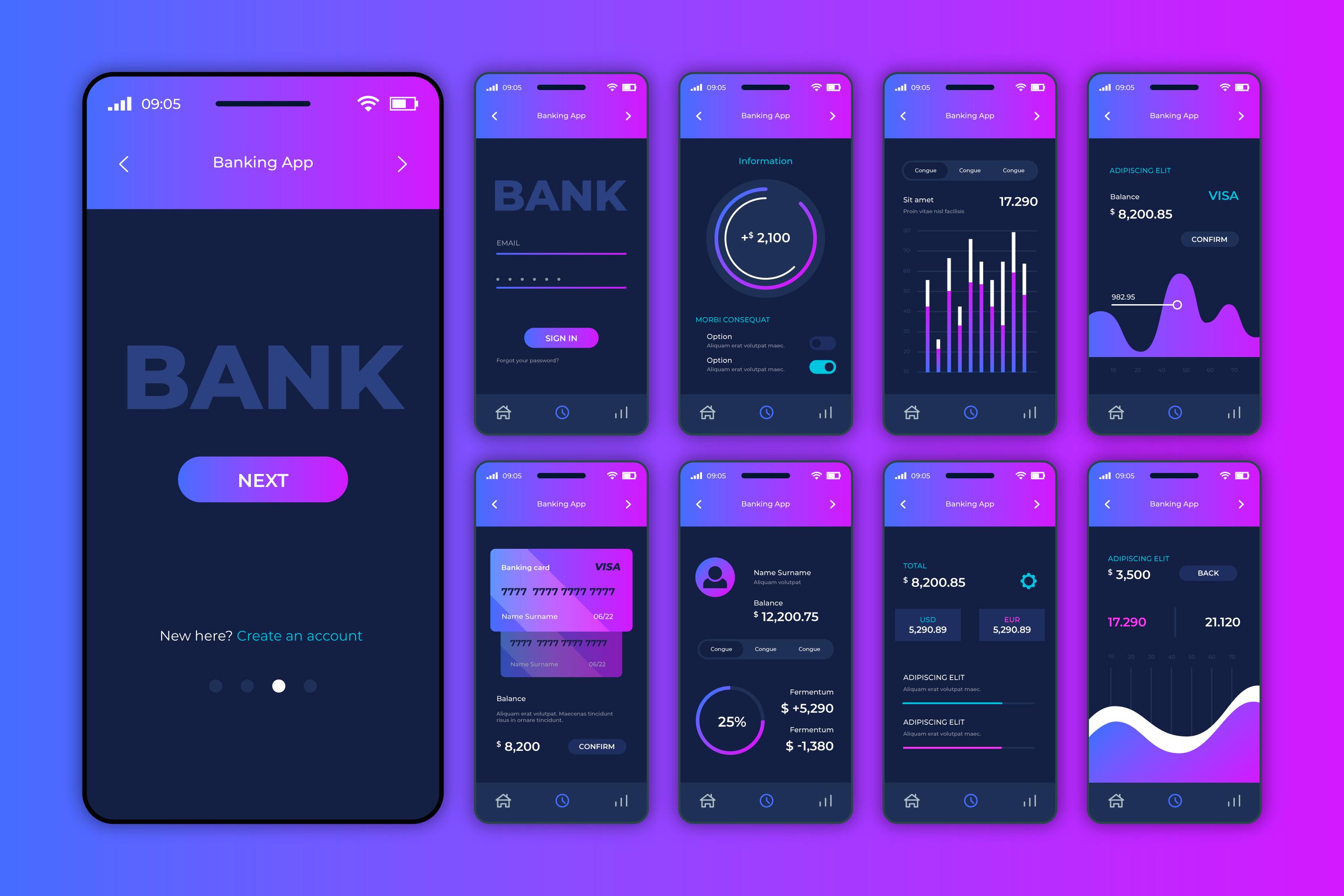
Dark mode as default, not an option
The shift happened faster than most predicted. Dark backgrounds with light text are now the default for AI and developer-facing SaaS products. Not because dark mode is trendy — because it signals modernity, technical sophistication, and premium quality.
The execution matters though. Bad dark mode is worse than a white background. The common mistakes: insufficient contrast ratios (accessibility failure), pure black backgrounds that feel heavy (#000000 is almost always wrong — use #0A0A0A or darker grays), and colored text that looks vibrant on a designer's calibrated monitor but washes out on a standard laptop screen.
The best dark mode implementations use a layered approach: a near-black base, slightly lighter surfaces for cards and containers, and strategic use of color for accents and interactive elements. Linear, Vercel, and Raycast are still the benchmarks here.
Motion with purpose
Scroll-triggered animations and micro-interactions have become expected, not exceptional. But the gap between purposeful motion and decorative motion is the difference between a site that feels polished and one that feels slow.
Purposeful motion guides attention. A hero headline that fades up as the page loads draws the eye to the most important content. A product screenshot that slides in from the side creates a natural reading flow. A counter that animates up when social proof metrics come into view makes the numbers feel more impactful.
Decorative motion is everything else — parallax effects on background elements that add nothing, hover animations on every element, page transitions that delay content loading. If it doesn't guide attention or communicate information, cut it.
The performance tax matters too. Heavy motion libraries that add 100KB+ to the bundle and cause jank on mid-range devices are a conversion killer disguised as polish.
Organic gradients over flat blocks
Hard-edged color blocks are giving way to organic, blurred gradients that create depth and atmosphere. The inspiration is less "design system component" and more "ambient light." Think: soft purple-to-blue transitions behind hero sections, warm glows around product screenshots, and gradient meshes that suggest dimension without being literal.
The key is restraint. One or two gradient elements per section create atmosphere. Gradients on every element create chaos. The best implementations use gradients as background atmosphere, not as the focal point.
Typography as identity
Generic sans-serif fonts (Inter, SF Pro, system fonts) are being replaced by typefaces that carry personality. SaaS companies are investing in distinctive typography as a branding lever — something that's instantly recognizable even without the logo.
The trend isn't toward decorative or display fonts. It's toward well-chosen workhorse typefaces with distinctive characteristics: slightly geometric sans-serifs, modern serifs for editorial feel, or monospace fonts for developer-facing products. The font choice signals who the product is for before the visitor reads the words.
Accessibility as a design foundation
This isn't a trend — it's a correction. WCAG compliance is now a baseline expectation, driven by both legal pressure (ADA lawsuits against websites increased 300% since 2020) and the recognition that accessible design is better design for everyone.
The practical impact on SaaS design: minimum contrast ratios are enforced in design systems, not just checked after the fact. Focus states are designed, not defaulted. Form labels are visible, not hidden behind placeholder text. Color is never the only way to communicate state (error, success, warning).
The companies doing this well don't treat accessibility as a constraint — they treat it as a quality bar that elevates the entire design.
What's looking dated
Some patterns that signaled "modern SaaS" two years ago are now visual clichés: abstract 3D illustrations that look AI-generated (because they are), hero sections with rotating text animations, glassmorphism cards with heavy blur effects, and gradients that look like Instagram circa 2018.
The direction is toward authenticity, specificity, and restraint. Less decoration, more intention. The best SaaS websites in 2026 feel confident — like they've made deliberate choices about what to show and what to leave out.