Dark Mode Done Right: The Implementation Guide for SaaS Websites
Dark mode isn't just inverting colors. Bad dark mode is worse than no dark mode. Here's the complete guide to implementing dark mode that looks premium and converts.
Author:
Weabers Team

Dark mode is everywhere. Good dark mode is rare.
The shift to dark mode as the default for SaaS and AI product websites happened fast. In 2024, it was a trend. In 2026, it's an expectation — especially for developer tools, AI products, and technical SaaS. But most implementations are bad. Not "slightly off" bad — "actively hurting the user experience" bad.
The common mistakes are predictable: pure black backgrounds that feel oppressive, insufficient contrast that makes text unreadable, colored elements that look vibrant on a designer's calibrated display and wash out on a standard laptop, and images with white backgrounds that scream against a dark page.
Here's how to implement dark mode that actually looks premium and maintains usability.
The color foundation
Never use pure black (#000000). Pure black creates maximum contrast with white text, which sounds good until you stare at it for more than 10 seconds. The high contrast causes eye strain. Use a very dark gray instead: #0A0A0B, #111111, or a dark blue-gray like #0D1117 (GitHub's approach). The difference is subtle but significant for comfort.
Build a layered surface system. Dark mode needs visual hierarchy, and you can't use shadows the way you would on light backgrounds. Instead, use lighter surfaces to indicate elevation. Background: #0A0A0B. Cards and raised surfaces: #141414. Hover states: #1A1A1A. Borders: rgba(255,255,255,0.08). This creates depth without shadows.
Adjust your brand colors. Colors that look great on white backgrounds often look wrong on dark backgrounds. Saturated blues, greens, and purples can feel too intense or neon-like against dark surfaces. Reduce saturation slightly and increase lightness for dark mode. Your primary blue at #2563EB on white might need to become #3B82F6 on dark.
Typography and contrast
Don't use pure white for body text. #FFFFFF on a dark background is almost as harsh as #000000 behind white text. Use a slightly muted white: #E5E5E5 or #D4D4D4 for body text. Reserve pure white for headlines and emphasis where you want maximum punch.
Check contrast ratios religiously. WCAG requires 4.5:1 for normal text and 3:1 for large text. In dark mode, the most common failure is secondary text (muted labels, captions, timestamps) that's too close to the background. That gray that looks fine on your retina display is invisible on a standard office monitor.
Consider font weight. Light fonts (300 weight) that look elegant on white backgrounds can look thin and hard to read on dark backgrounds. You may need to bump body text from 300 to 400 or from 400 to 500 for dark mode. The darker the background, the heavier the font needs to be to maintain the same perceived weight.
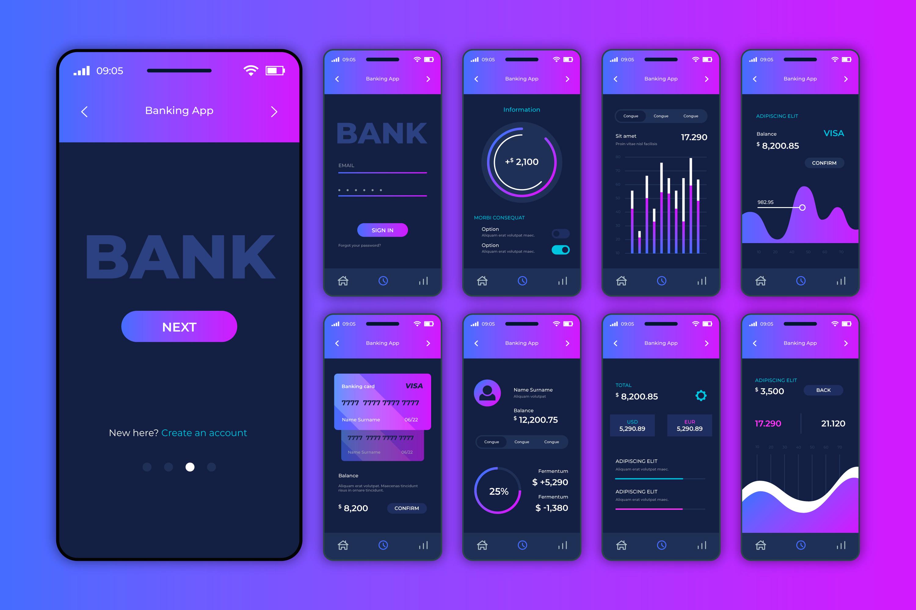
Images and media
Transparent PNGs with dark subjects disappear. Logos, icons, and illustrations designed for light backgrounds often have dark elements that blend into the dark background. You need dark-mode variants of these assets — or use a subtle light background/border around them.
Screenshots need treatment. If your product has a light UI, screenshots on a dark marketing site create a harsh contrast that feels jarring. Options: add a subtle border-radius and shadow to screenshots, place them on a slightly elevated surface, or show the dark mode version of your product if one exists.
Reduce image brightness slightly. Full-brightness photos on a dark page feel overpowering. A CSS filter of brightness(0.9) on images creates a more harmonious integration with the dark surrounding.
Interactive elements
Focus states need to be visible. Default browser focus rings are nearly invisible on dark backgrounds. Design custom focus states with sufficient contrast — a visible outline or a subtle glow effect that's clearly distinguishable from the surrounding elements.
Hover states need more contrast. On light backgrounds, a subtle 5% darker shade works for hover. On dark backgrounds, you need a more visible change — a border lightening, a background lightening, or a subtle glow. The visitor needs to clearly see what they're about to click.
Form fields need clear boundaries. Input fields on dark backgrounds should have a visible border or a slightly different surface color. A borderless input field that blends into the background is frustrating for users who can't tell where to click.
The performance bonus
Dark mode on OLED screens uses significantly less power — dark pixels are literally turned off. As OLED becomes standard on laptops and phones, dark mode isn't just an aesthetic choice — it's a practical one. Users browsing your site on battery power will have a better experience with dark mode because their device lasts longer.
This is a small detail, but it's emblematic of why dark mode has become the default for technical audiences: it's not just about looking cool. It's about respecting the user's context and creating a comfortable, sustained reading experience.